Luxury homes are not simply viewed — they are experienced. From the moment a buyer walks through the door, color harmony and intentional staging shape perception, emotion, and ultimately value.
Why Color Matters in Luxury Home Design
Color is one of the most powerful psychological tools in real estate. It influences how spacious a room feels, how light travels through the home, and how buyers emotionally connect to the space.
In luxury properties, color should achieve three goals:
- Create timeless elegance
- Highlight architectural features
- Allow buyers to imagine their own lifestyle within the home
Luxury design avoids trends that date quickly and instead focuses on refined, cohesive palettes.
Timeless Luxury Color Combinations
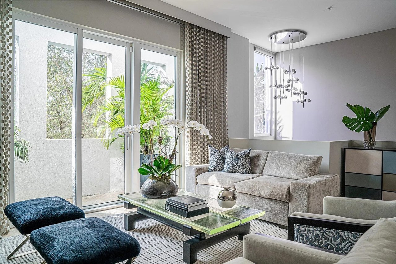
Soft Neutrals & Warm Whites
Best for: Modern luxury, transitional homes, resale appeal.
Neutral palettes remain the gold standard in luxury staging because they create calm sophistication.
Key colors:
- Warm white
- Cream
- Taupe
- Soft beige
- Light greige
Why it works:
- Makes spaces feel larger
- Enhances natural light
- Appeals to the widest buyer audience
Furniture pairing:
- Linen or boucle sofas
- Light wood tables
- Minimal metallic accents
- Textured rugs
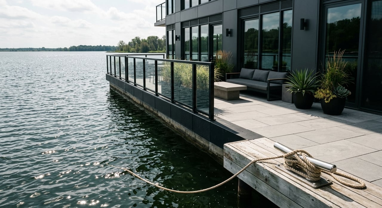
Black, White & Metallic Accents
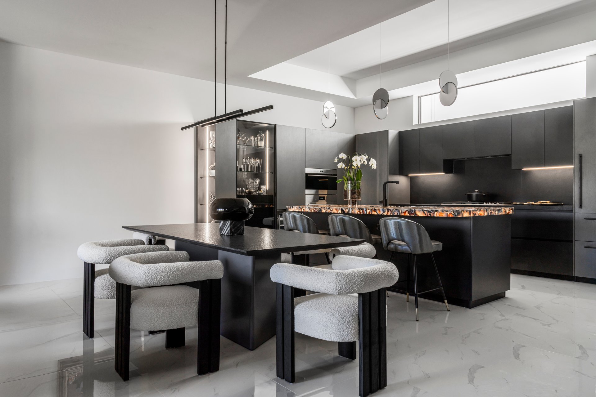
Best for: Contemporary and architectural homes.
A monochromatic palette delivers drama and refinement when executed correctly.
Key colors:
- Matte black
- Crisp white
- Gold or brushed brass accents
Design tip:
Balance contrast with soft textures to avoid a cold atmosphere.
Furniture pairing:
- Sculptural chairs
- Glass or marble tables
- Statement lighting fixtures
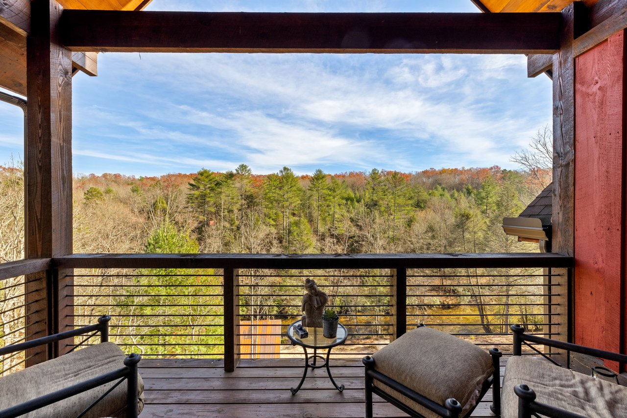
Earth Tones & Natural Luxury
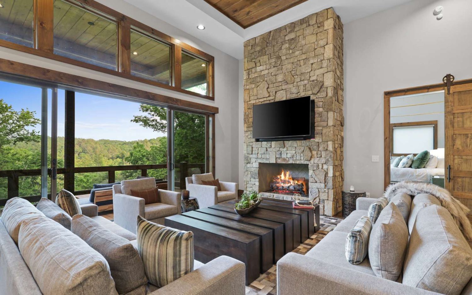
Best for: Mountain homes, estates, and nature-focused properties.
Earth-inspired palettes create warmth and emotional comfort.
Key colors:
- Olive green
- Clay
- Sand
- Walnut brown
- Stone gray
Furniture pairing:
- Solid wood pieces
- Leather accents
- Stone or ceramic décor
- Organic textiles
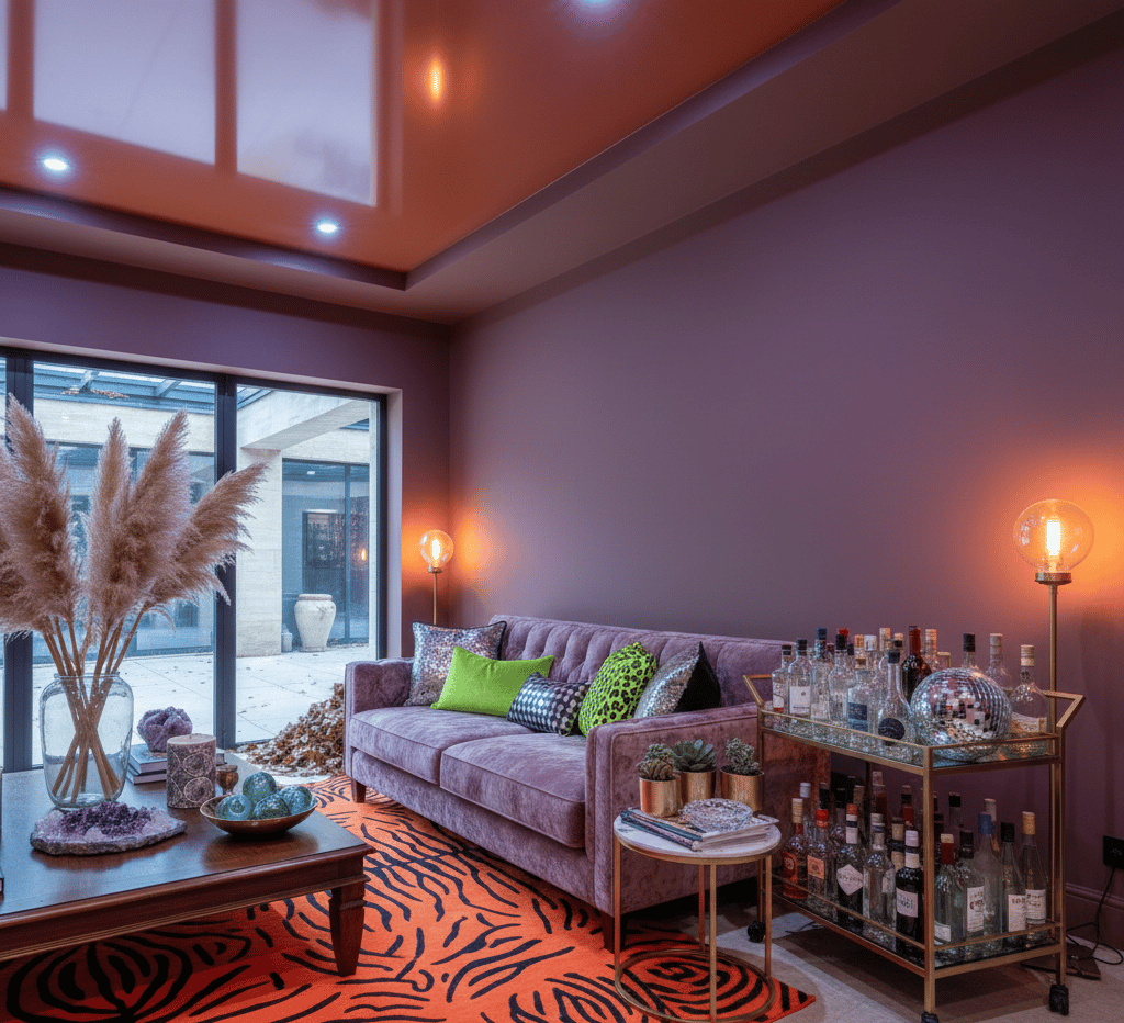
Navy, Charcoal & Jewel Tones
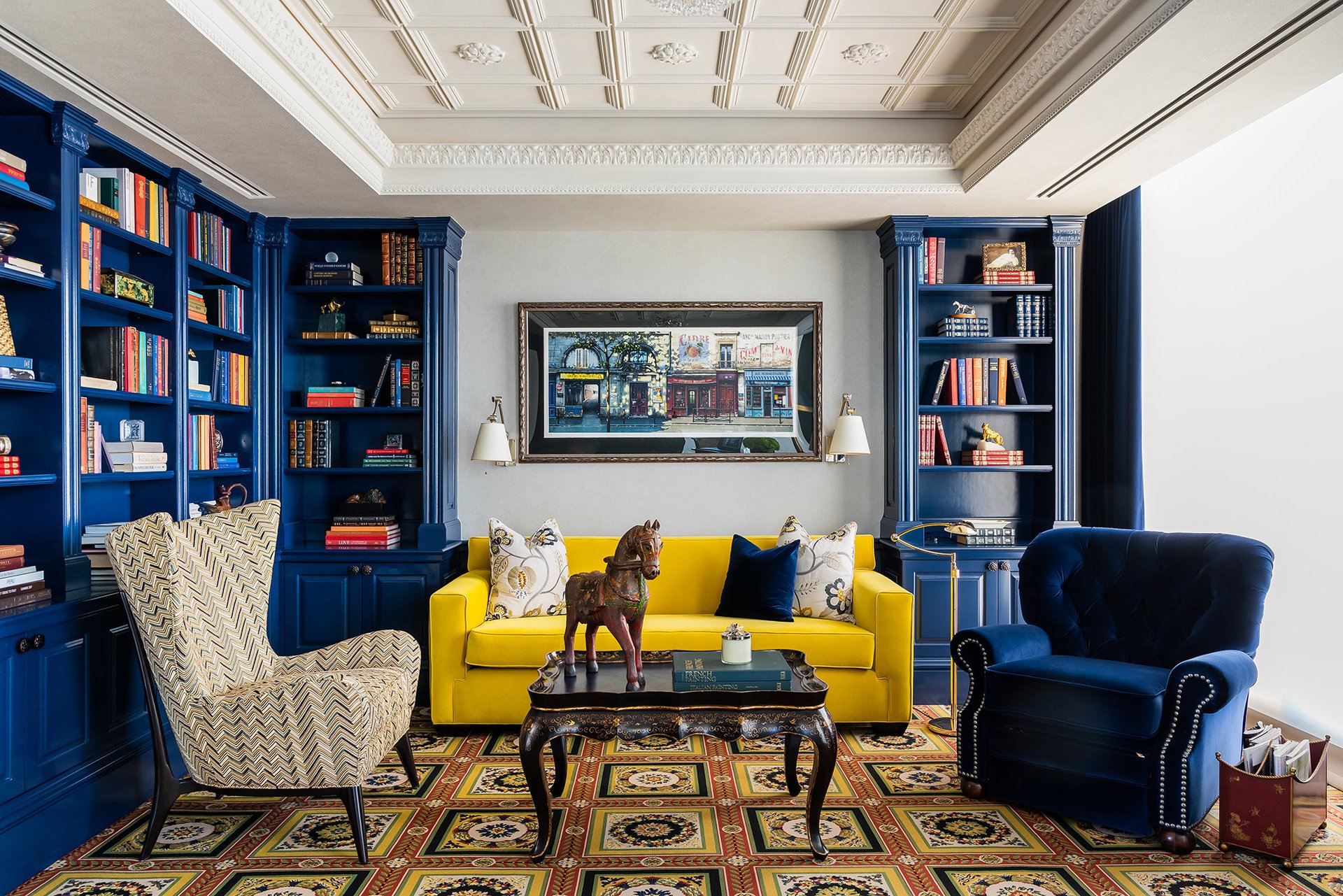
Best for: Formal dining rooms, offices, and statement spaces.
Key colors:
- Navy blue
- Emerald
- Charcoal gray
- Deep plum
Furniture pairing:
- Velvet upholstery
- Brass lighting
- Marble surfaces
- Art-focused décor
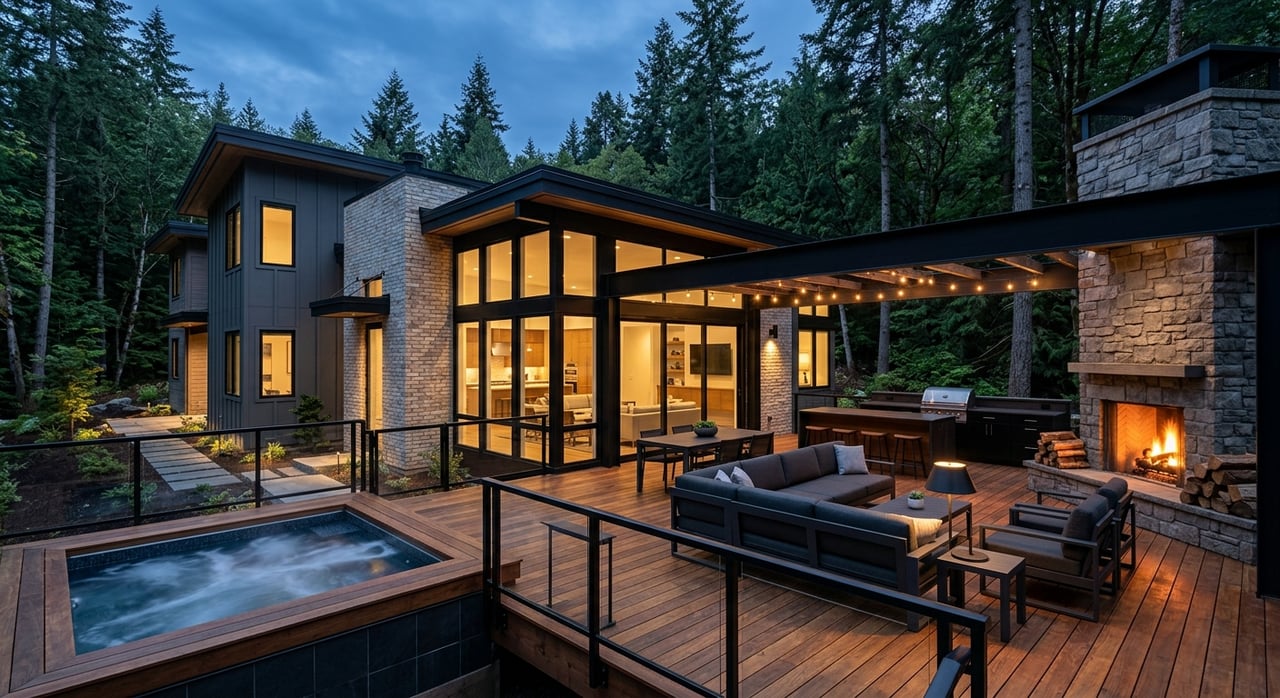
Essential Furniture Considerations When Staging a Luxury Home
Luxury staging is not about filling rooms — it is about intentional storytelling.
Scale & Proportion
Furniture must match the home's architecture.
- Large rooms → oversized sectionals and substantial tables
- High ceilings → tall lamps, large art, vertical elements
- Avoid undersized furniture that makes spaces feel empty
Quality Over Quantity
Luxury buyers instantly recognize quality.
Choose:
- Solid materials
- Designer-inspired silhouettes
- Upholstery with texture and depth
Avoid overcrowding. Negative space communicates luxury.
Cohesive Flow Between Rooms
Every room should feel connected through:
- Repeating color accents
- Similar materials
- Consistent finishes
Think of the home as one continuous experience rather than separate spaces.
Lifestyle-Based Furniture Placement
Stage for how buyers want to live:
- Conversation seating in living areas
- Reading nook near windows
- Outdoor entertaining zones
- Home office setups
Luxury buyers purchase aspiration, not just square footage.
Common Luxury Staging Mistakes to Avoid
- ❌ Overly trendy colors
- ❌ Personal or bold thematic décor
- ❌ Too many accessories
- ❌ Poor lighting temperature mix
- ❌ Ignoring outdoor living spaces
Final Thoughts: Designing Emotion, Not Just Spaces
Luxury staging succeeds when buyers feel an immediate emotional connection. The right color combinations paired with intentional furniture choices elevate perception, photography, and ultimately property value.
A beautifully staged luxury home doesn’t just show well — it tells a story of refinement, comfort, and possibility.
Credits goes out to FAVA DESIGN GROUP for these wonderful masterpieces
You may visit their website at